
Knowing where your audience opens your emails has become almost as important as knowing how they respond to it. More than 66 percent of your audience now reads email on a mobile device, according to consumer device preference reports. That figure could be as high as 80 percent, depending on your business and how your customers interact with you. Given these figures, it’s no surprise that smart email marketers are embracing the mobile-first mindset. With the mobile revolution have come key changes to how email marketers do business.
Sub-Headers Matter More
On a desktop screen, most marketing email has a sub-header that appears at the top of the body, usually in a smaller font and often with a link to the web version of the content or an unsubscribe link. The same email on a mobile device displays the first few words of the email’s content under the subject line – in this case, the sub-header. Mobile-first email marketing makes the most of that prime real estate by including contact information or key elements of the offer in that line. While you need to include your unsubscribe link within the email, you don’t have to put it first. Email marketers who do are missing out on an important opportunity to connect with a vast mobile audience right away.
Every Email Is Mobile-Friendly
Some marketers use their sub-headers to offer a mobile-friendly link within their email, but they’re also missing the boat. With mobile-first design, every version is mobile-friendly. Instead of spending time and effort on additional content to fit the small screen as well as desktop machines, marketers are streamlining their graphics and paring text fields for a mobile audience. From logos to photos, email elements are simplified. Content appears in bulleted lists instead of large blocks of text. These changes make mobile readers happy, but they’re also good for audiences who read their email on desktop screens.
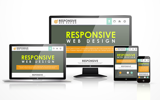
Responsive Design Fits All Devices
Mobile-first email marketing makes smartphone and tablet users a top priority by using responsive design that displays information differently depending on the device used to view it. Instead of fixed locations for images, text fields and calls to action, these elements are fluid. Percentages, not fixed dimensions, define how responsive email appears to readers.
This design philosophy makes even more sense when you think about the number of email readers who view the same email on multiple devices. Ideally, your leads will see your email and take action right away, but not every customer’s decision-making process works that way. Some need time to research their buying decisions or get approval for a purchase. Others make important decisions outside the office and want to act when inspiration strikes. Responsive design ensures that your prospects see the same message across all platforms.
Bite-Sized Writing
White space is always important for web design, email marketing and other digital content, but it’s even more vital when working with mobile devices. Breaking text into smaller paragraphs dramatically improves readability on small screens. While most modern smartphones and tablets have pinch/zoom features, some devices display fixed font sizes, so using smaller blocks of text gives users with these devices a break.
The Email Marketing Renaissance
Email marketing’s low cost and wide reach has made it a vital part of almost any campaign, but with the rise of mobile technology, it’s enjoying a resurgence. After a dip from 2007 and a wide plateau from 2009 to 2011, email open rates have increased fairly steadily. Today, average open rates have topped 30 percent, and mobile email is a big reason why. Give your audience easy access, these numbers suggest, and they’ll respond.
© Reach Marketing LLC 2015 All Rights Reserved.


