Email itself is an amazing technological achievement. The ability to communicate instantly with any number of customers has revolutionized marketing, but email hasn’t stayed static. As technology changes, so have email’s capabilities. Embracing mobile-first email, incorporating responsive email design, and customizing email via marketing automation are some of the ways you can bring your email campaigns into the future.
Mobile-First, Not Just Mobile-Friendly
Not too long ago, people read their email when they got to work and sat at their desks. For email marketers, mobile access was a footnote, something to consider only after designing the email for desktop viewing. Email recipients are now more likely to read your message on a mobile device than on a desktop machine, and smart marketers take advantage of this by prioritizing mobile design. It isn’t enough to include a link to a mobile version at the top of emails; think of mobile users first, then design for desktop readers. On average, three out of four readers will delete email they can’t read on mobile, so it’s vital to grab your leads’ interest where they meet you first – on mobile devices.
To improve readability on mobile platforms, follow these conventions:
– Use a large enough font for readability, but don’t go so large that users with small screens need to scroll excessively. Generally, an 11-point or 12-point font for body text and a 20-point font for headlines are preferable.
– Keep calls to action positioned prominently at the top of emails. One excellent place for a clear call to action is in the sub-header, which often displays as the first line of text after the subject line on mobile devices.
– Use clear, simple graphics. A detailed image that looks great on a wide-screen desktop format won’t translate as well to the small screen.
– Keep text short and focused. Readers on smartphones don’t want to scroll repeatedly and should see all your email’s salient points at a glance.
Responsive Design for Email
To ensure readability for mobile users and greater detail for desktop users within the same email, many marketers choose responsive email design. With responsive design, an email created within a marketing automation system uses modular components that rearrange themselves depending on how the recipient views them. Images that appear within body copy on a desktop, for instance, will appear after the text for mobile users. The overall arrangement of design elements is fluid, so your email looks legible, polished, and persuasive on all platforms.
Another advantage of responsive design is its forward thinking. Not only does it allow email marketing to work on any currently existing device, but it adapts itself to the devices that aren’t on the market yet. Marketing automation systems that use responsive design templates to construct email work now and in the future, keeping companies that use them current with the latest technology.
Customization and Targeting
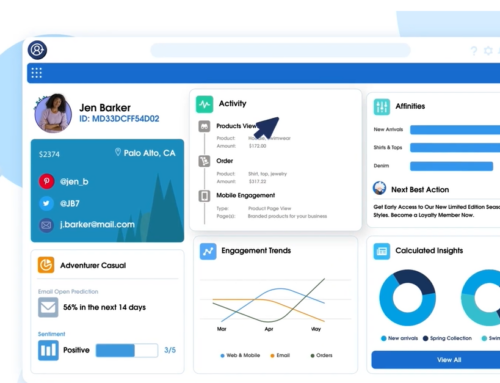
Email isn’t a monologue; it’s the first few lines of a conversation. Like any conversation, it’s personal, addressing an individual rather than a broad audience. Targeted email that addresses each lead specifically has a much higher response rate than a broad-based message. Narrowly targeting selected audience segments is a technique marketers have used for years, but only with the rise of marketing automation have they been able to do it with such precision. Customization options now automatically take a recipient’s demographic, firmographic, and behavioral data into account when communicating with them.
© Reach Marketing LLC 2015 All Rights Reserved.


