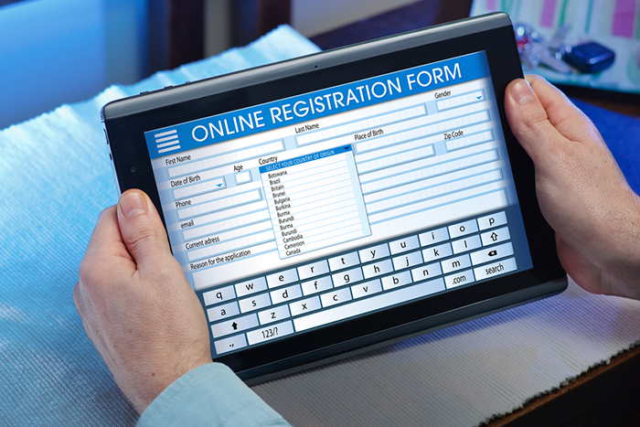
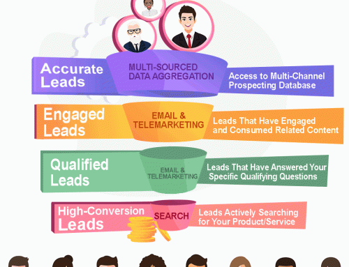
When does a visitor turn into a lead? The transformation happens when your visitor actively chooses to share data – in other words, when he or she fills out a form. Given how important forms are for your lead gen strategy, it only makes sense to make them as streamlined and appealing to fill out as possible. Despite this, many marketers don’t give their forms much thought. They add a few line items they want to know, and that’s that.
If you want to convert more visitors into leads, making your forms compelling can help. Here’s how to improve the functionality of your forms and get more response from them.
Simplify
Leads are naturally efficient. The fewer clicks or keystrokes they have to enter to get to where they want to go, the better, as far as they’re concerned. Yet many forms involve mazes of drop-down boxes, radio buttons, and blank entry forms. Take a look at your current forms and think about where you can eliminate a step or two.
To give you an idea of how important simplifying steps can be, consider what Microsoft discovered in going from Windows XP to Windows Vista. The old XP shutdown was a one-step process – you had a choice of three buttons and clicked on “shut down” at the end of your session. Vista replaced that with the same choices in a drop-down menu, which required three clicks: one to open the menu box, one to select the option, and one to execute it. This small change meant fewer people shut down their computers.
If people are unwilling to move from one click to three, how likely are they to fill out lengthy forms?
Focus
Forms shouldn’t exist in isolation; instead, they should contain prominent reminders of why a lead’s filling it out. In your form dialogue, emphasize why you’re asking for the information to reinforce the reward leads get for completing them. For example, your email address line could include the phrase, “Where would you like to receive your email newsletter?” This is a reminder that there’s something good waiting for them across the form’s finish line.
Other ways to focus on the purpose of your form might include images of what leads will receive or pull quotes from downloads. You want to give leads motivation throughout the process so they have the momentum to complete the form, so think of how you can present the benefit of completion in an appealing way.
Take It Step by Step
A lengthy form is a benefit to you only if leads fill it out, but they’re less likely to do so when confronted with a dozen blanks. Instead, break longer forms into stages or steps. If your form requires a name, email address, company name, job title, and mailing address, it can become a fairly high hurdle for leads to jump to get to where they want to go. Breaking that down into an “About You” step containing the first two pieces of information and an “About Your Business” stage with the other three bits of firmographic data makes the form feel more purposeful and less cluttered.
Use Mental Shortcuts
Our brains love shortcuts. If we see one piece of evidence, we can extrapolate from it to draw a whole host of inferences. For example, if we see a club with a line of people in front of it, we assume it must be an exciting place to be. Brownie mixes could be made with powdered eggs already inside, but because people feel more of a sense of ownership and pride when they’re more involved in making something, manufacturers leave out the egg and direct bakers to add their own. These cognitive biases can work to your advantage when designing forms too.
Remember how a multi-stage form gets more responses than a single page-long form would? Add a completion bar to that form, and you enhance response rates even more, especially if you already fill in part of the bar for them. Just by being on the page, they’ve completed a portion of the progress bar, which encourages them to finish what they’ve started. Use that tendency toward completionism, and you’ll get more finished forms.
Dress Up Your Forms
Visual interest encourages people to finish forms too, yet too many forms are just blank white bars on a static page. You can communicate the same information in more exciting ways. Visualize a form that asks a lead about company size. You could express that with radio buttons and figures, or you could present them with clickable illustrations for small, medium, and large business sizes. On your end, the bland buttons and numbers are equivalent to the eye-catching images, but it’s more engaging to choose an illustration that matches business size.
Finding ways to streamline your forms and make them more exciting pays off immediately with more leads and higher engagement, so don’t let your forms bore your visitors.
© Reach Marketing LLC 2016 All Rights Reserved.

