
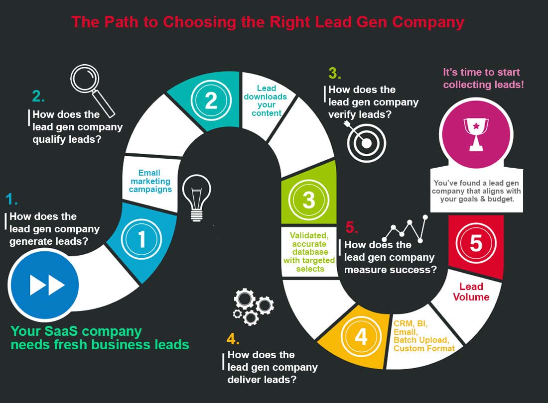
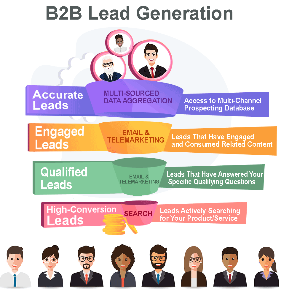

Email’s older than you might think, arriving on the scene in the early 1970s. Chances are, it’s also newer than you think – that is, it’s positioned to be a mainstay of business well into the future and takes full advantage of technologies that are still on the horizon. While it’s impossible to predict exactly what marketing and lead generation will look like in the year 2026, it’s a safe bet email or something like it will be part of the bigger picture.
Here’s how you can be proactive with your email marketing strategy and set yourself up for success well into the future.
Mobile-First Design
Not more than a decade ago, you could read your email anywhere – as long as “anywhere” had a bulky desktop monitor. Marketers and lead gen experts could develop content for a single kind of platform without having to think about accessibility and ease of use. If mobile design was a concern at all, it was a footnote. That’s changed dramatically. Today, a business that fails to take mobile email access into account risks losing the majority of its intended recipients. It isn’t enough to be mobile-friendly by retrofitting desktop content with a couple of links to a mobile version, either; mobile-first design is a must. To meet your audience where they are, make mobile-first design a core element of your email lead gen content.
To emphasize mobile-first marketing, follow these best practices:
- Use the right default font size. Going too small impairs readability, but an overly large font requires unnecessary scrolling. Using an 11-point or 12-point default sans-serif font for email body text and 16- to 18-point fonts for headlines will work best for most readers’ devices.
- Make the most of email sub-headers with prominent calls to action. Email often displays on smartphones with the subject line and the first few words of the email’s body, so make it count with a meaningful, relevant call to action.
- Keep graphics simple and clean. The average smartphone screen has just a few square inches of real estate, far fewer than a desktop view offers, so make sure your images look as bold, clear, and compelling on a hand-held screen as they do on a laptop or desktop.
- Email recipients who use mobile devices to check their email are skimmers rather than readers. Text should be concise, straightforward, and bold for maximum impact in a minimal space.
Responsive Design
Phones a decade ago looked only a bit like today’s sleek glass and metal bars. Ten years from now, technology will undoubtedly evolve to meet new needs and offer greater functionality. Responsive email design allows you to prepare for whatever tech your audience is using today, tomorrow, and years from now because it treats elements of your email as modular units that can move to suit the device displaying them. Fluid design lets email make an impact on any platform and future-proofs your email templates as well as the content they contain. That’s also great for the multi-platform users who comprise the large majority of business email recipients, who can now check their email on a smartphone, pull it up on a laptop, and forward it to a colleague in the
Customization
Successful lead generation depends on relevance, and to be relevant, you need to speak with prospects in ways that resonate with them. Customization is a high priority for marketers now, and it’s going to become even more important in the near future as audiences become increasingly accustomed to having tailor-made experiences built around them. Targeted, customized email that addresses each lead’s needs can cut through the ever-increasing flood of email flowing into your leads’ in-boxes.
Agile, responsive email featuring highly customized content and mobile-first design is more than the gold standard of email marketing today; it’s a way to connect with your market well into the future.
© Reach Marketing LLC 2016 All Rights Reserved.

